 Nov 18, 2021·1 reply
Post more players in 90s jerseys please
 Nov 18, 2021
 Anna
Annathe new burberry logo is a travesty
Tbh everything that Riccardo Tisci has done with Burberry has been mid 🥲
 ghosting ®️Nov 18, 2021Vox
Hell nah
😡😡😡
 Nov 18, 2021
 GloMide
Old Burberry logo>>
- ghosting ®️Nov 18, 2021Vox
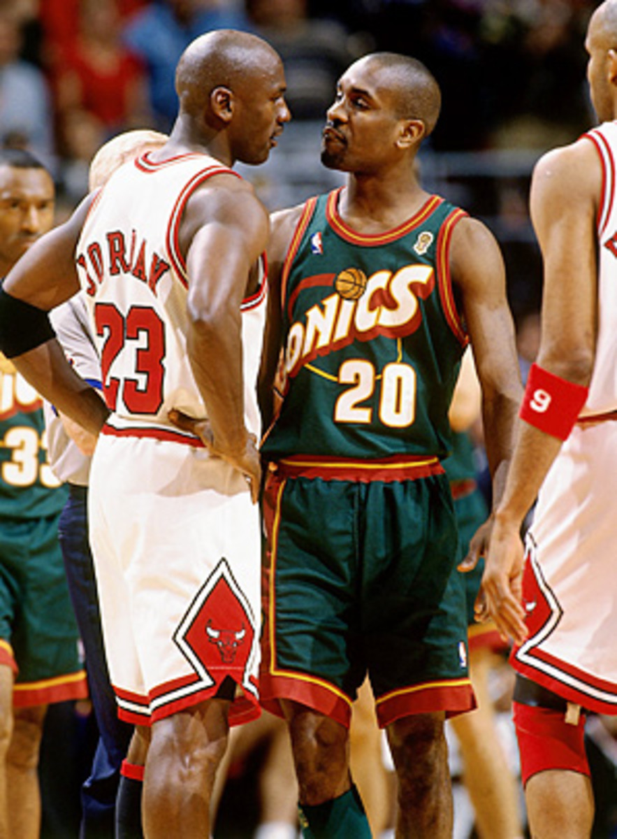
Post more players in 90s jerseys please
- ghosting ®️Nov 18, 2021
Don Nelson, Timmy, and KG in the background

 Nov 18, 2021·1 replyghosting
this the best one tho
You stanning too hard
- ghosting ®️Nov 18, 2021·1 replyYoungFashioned
You stanning too hard
sorry I didn't put the crypto kings #1 🙄
- Nov 18, 2021·1 replyghosting
sorry I didn't put the crypto kings #1 🙄
You wanna die?
- ghosting ®️Nov 18, 2021YoungFashioned
You wanna die?
this made me laugh so hard 😭😭
 Nov 18, 2021
yep thats modern corporatised, focus grouped design for you. I'm a graphic designer and the lack of leadership from higher ups to take strong and decisive approaches is just sad. to many f***ing bean counters get a say on s***!!!!
 OPNov 18, 2021·1 reply
 Gary Givenchy
I could make a similar post for NBA Team logos
The bigger a company gets the more cookie cutter corporate the art direction tends to get
i’m blaming it on kering and lvmh at this point it seems like they brought this on high fashion
- OPNov 18, 2021
 chrisftw
its just modern minimalist design
and that’s why i don’t like it minimalist modern designs have their place but here nah it don’t make sense for any of these brands
- Nov 18, 2021·1 replyv12
i’m blaming it on kering and lvmh at this point it seems like they brought this on high fashion
Exactly. I think it’s just a consequence of being a part of a major corporation.
- OPNov 18, 2021Gary Givenchy
Exactly. I think it’s just a consequence of being a part of a major corporation.
when most of high fashion is owned by two niggas who are known for being money hungry b******s what else can we say?
 Nov 18, 2021
Removing the accent on Celine is too funny to me

Idk if this is edgy but I kinda think the old ysl logo looks kinda dated in a bad way
 proper 🔩Nov 21, 2021·1 reply
this how I felt when I seen @thebootywarrior new username today ngl
 Nov 22, 2021
YSL was a f***in mess, the rest could’ve still rocked tho
- Nov 22, 2021
Also it’s like 2-3 different companies that own all these brands, so when changes were made (for good enough reasons) they were made across the board
 Nov 28, 2021proper
this how I felt when I seen @thebootywarrior new username today ngl
