 OPAug 10, 2022
 internet buddy
Is it at the top of OP? If so, it’s classic. Perfectly visually striking
Yessir
Thank you so much
- OPAug 10, 2022
 Rainbow Road
everything is HARD, loving the aesthetic of this so far and I can't wait to hear the sound to match it
 thank u so much man fr
Cant wait for u to hear it  Aug 10, 2022·1 reply
Cover does look good, if a little busy. I like it tho. how do you feel about it @Mitchell ?
- OPAug 10, 2022
 innuendo
cover art looks fireee
thank u so much bro - OPAug 10, 2022
 Sir Swagalot
LOVE IT
the color palette and artwork go so well together thank u so much man frfr - OPAug 10, 2022Sir Swagalot
@Mitchell BEABADOBEE FEAT !!
Yessir thats the next single
- OPAug 10, 2022
 tyreek
love it bro, definitely need a physical of this
Designing the cd as we speak
Cant wait
- OPAug 10, 2022
 saph
saphlove it, you guys always kill it w the art
Thank u so much man
- OPAug 10, 2022
 katherine world
Beautiful 💖 someone else already said this but i love the photo layout on the front and back cover, as well as the extrad out crayola skin tones
thank u so much omg lov u
- OPAug 10, 2022katherine world
Not big on the fonts but they do tie everything together nicely, good s*** overall
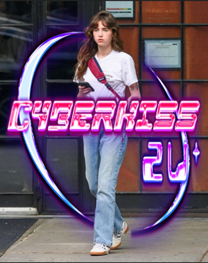
i feel u, for the theme felt like the big bulky fonts fit it nicely because thats how a lot of the fonts from the era were looking i love the purple one on the back cover, the cyberkiss on the front is kinda like a loading screen thats why its not all the way filled in yet
- OPAug 10, 2022
 Zaywop
CLASSIC OTW
this time i can say 100% no cap!!!!
- OPAug 10, 2022
 babylon sherm
Front and back covers are
 outfits very hard too
Thank u so much, especially appreciate the love on the back its my favorite piece of art from this entire era
Its the universe i was in during my last shrooms trip and it was able to be captured perfectly on the back
- OPAug 10, 2022katherine world
Facts thats my fav single cover theyve dropped thus far
yea best single cover of ours ever i think, that and the frankie muniz one
- OPAug 10, 2022·1 reply
 p apollo
yessir this fire!!! I love the colors. between the promo posters and the artworks the direction is super cool. Always love when the art direction seems fleshed out and not just an afterthought, like I get the feeling the music really gonna sound like how the cover looks.
that stylized BSK logo too hard need that on a navy shirt immediately
yeah i think the music is super fitting
i really cant wait for u guys to hear it, and really chop it up w u guys i wanna let u guys know the influences and thoughts behind everything when its out bc its such a detailed thing
- OPAug 10, 2022·1 replyPhlegm
Cover does look good, if a little busy. I like it tho. how do you feel about it @Mitchell ?
thank u man im glad u like it
I’m in love with it
it fits the universe perfectly, the music is a bit busy also not even like every song is busy just the amount of sounds are on the tape, plus i feel like so many people are making really minimal covers and s*** which is definitely really fresh i love minimal covers but i miss like really colorful and saturated covers.
Without getting into too much nerdy s*** the tape kinda takes place in like this digital universe and where the front cover is is kinda like the load in spot for the cover, and the side is the characters and the loading screen and then the back cover is like a screenshot of the universe where everything takes place in it
 Aug 10, 2022·1 replymr get dough
thank u man, i appreciate that genuinely
s*** is dope for real and ir doesnt make me think of any other cover which is impressive
 Aug 10, 2022·1 replymr get dough
Thank you brotha, did u ever check that text
I'm gonna listen in a minute. Might even take a stab at a vocal run too
- OPAug 10, 2022·3 replies
@FIFTY950 @XantaClaus @BernieX my brothers in christ what do u guys think
- OPAug 10, 2022·1 replyRICKY 2320
s*** is dope for real and ir doesnt make me think of any other cover which is impressive
man thank you so much, definitely wanted to make something that looked a bit different from like most covers this year.
i know we s*** on each other pretty hard and probably will continue too, but it genuinely means a lot to me you showing support and s***, thanks man fr
- OPAug 10, 2022This is Bow
I'm gonna listen in a minute. Might even take a stab at a vocal run too
all good if u dont vibe w it, just wanna hear new bow and arrow
- Aug 10, 2022·1 replymr get dough
@FIFTY950 @XantaClaus @BernieX my brothers in christ what do u guys think
The visuals are dope asf man i cant wait to hear what yall got
- Aug 10, 2022·1 replymr get dough
thank u man im glad u like it
I’m in love with it
it fits the universe perfectly, the music is a bit busy also not even like every song is busy just the amount of sounds are on the tape, plus i feel like so many people are making really minimal covers and s*** which is definitely really fresh i love minimal covers but i miss like really colorful and saturated covers.
Without getting into too much nerdy s*** the tape kinda takes place in like this digital universe and where the front cover is is kinda like the load in spot for the cover, and the side is the characters and the loading screen and then the back cover is like a screenshot of the universe where everything takes place in it
this makes more sense. i agreed with some of the comments that other people made, and i had my own list of small things but honestly its firmly not as important as the music. why is the lip print on the "front" different than the "back" tho (I'm assuming this gonna be for cds too or some physical version). only asking this much cus i like art, n covers.
Only real thing is it wouldve been cool to see all the band members in it but idk how the in/out thing works and how you guys are controlling that so feel free to disregard. you also have everyone in some of the other promo material.
I love that you are not trying to do the minimal cover thing. Idk what the deal is but i guess it gets hard to find something fitting the more complicated it gets, and maybe it's less discernible at our small phone screen sizes. just guessing tho
i will say it doesn't look like much ive seen recently. except faintly, the tlc fanmail cover

- Aug 10, 2022·1 replymr get dough
yeah i think the music is super fitting
i really cant wait for u guys to hear it, and really chop it up w u guys i wanna let u guys know the influences and thoughts behind everything when its out bc its such a detailed thing
how long yall been cooking this for?
- OPAug 10, 2022·1 replyPhlegm
this makes more sense. i agreed with some of the comments that other people made, and i had my own list of small things but honestly its firmly not as important as the music. why is the lip print on the "front" different than the "back" tho (I'm assuming this gonna be for cds too or some physical version). only asking this much cus i like art, n covers.
Only real thing is it wouldve been cool to see all the band members in it but idk how the in/out thing works and how you guys are controlling that so feel free to disregard. you also have everyone in some of the other promo material.
I love that you are not trying to do the minimal cover thing. Idk what the deal is but i guess it gets hard to find something fitting the more complicated it gets, and maybe it's less discernible at our small phone screen sizes. just guessing tho
i will say it doesn't look like much ive seen recently. except faintly, the tlc fanmail cover
The lip on the front and the back only have a size difference, i think it’ll be easier to tell that when the physicals are around yeah, the size on the front is smaller because we wanted the cyberkiss to be legible, its just regular size on the back.
As far as the band members we put the 3 of us on the front bc we’re the ones who make all the songs, jack and jerry our drummer and synth player are apart of the live band and just recently jack will sometimes come and replay drums live (which adds a lot to the sound, hes a great drummer) but when we’re making the songs from scratch its just the 3 of us and we’re the only ones you hear on the record so it made sense to us to just have us on the front we didn’t want people to get confused on if they were vocalist or producers basically.
and yeah i understand that too, we’ve done minimal covers before too i have an appreciation for both but the music on this one definitely called for something a bit wilder il
and bro i love that fanmail cover that was definitely one of the points of references for like the fonts and s*** like that
- OPAug 10, 2022math fifty
The visuals are dope asf man i cant wait to hear what yall got
i cant wait for u to hear it either