 Nov 21, 2021
 ny bookers
Kanye don’t even know who that is
Jokes aside, he definitely does.
 Nov 21, 2021·3 replies
yall are so corny
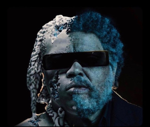
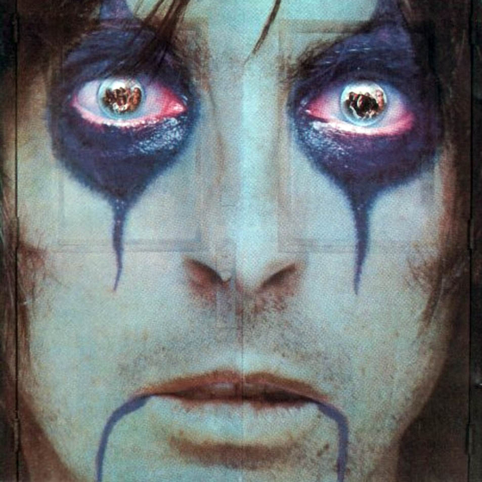
first, Heron Preston designed it
second, kanye loves Helvetica and uses it for everything
third, vince staples didn't invent blown up pics
fourth, heron said in his post he did this on photoshop talking to kanye by iMessage and the color is #iphoneblue
fifth, if you didn't understand the fourth its because you're poor and don't own an iPhone
 Nov 21, 2021
 THIB
THIBit’s not just the cover it’s the color, font and spacing too

this should've been in the OP
 Nov 21, 2021DIKALISM
yall are so corny
first, Heron Preston designed it
second, kanye loves Helvetica and uses it for everything
third, vince staples didn't invent blown up pics
fourth, heron said in his post he did this on photoshop talking to kanye by iMessage and the color is #iphoneblue
fifth, if you didn't understand the fourth its because you're poor and don't own an iPhone
Monserrat
 frenchpress ❇️Nov 21, 2021·1 replyDIKALISM
yall are so corny
first, Heron Preston designed it
second, kanye loves Helvetica and uses it for everything
third, vince staples didn't invent blown up pics
fourth, heron said in his post he did this on photoshop talking to kanye by iMessage and the color is #iphoneblue
fifth, if you didn't understand the fourth its because you're poor and don't own an iPhone
sixth, kanye invented
- Nov 21, 2021·1 reply
Probably whoever he paid to make that promo
- Nov 21, 2021·1 replyeasy
Probably whoever he paid to make that promo

aka the goat, Heron Preston
 Nov 21, 2021
ye invented
vince used a time machine and stole it
 Nov 21, 2021
- Nov 21, 2021·2 replies


 Nov 21, 2021
delete thread
- Nov 21, 2021·3 replies

 Nov 21, 2021https://twitter.com/4Ddumbask/status/1462188308457566210easy
- Nov 21, 2021
He put the same filter on it too 😂😂 Ye a fool for that one
 Mmm Hmm 😈Nov 21, 2021
Don't you know that Kanye invented?

 Nov 21, 2021·1 reply
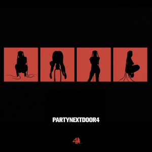 whippet volverse
always felt like vince and Ye would make a good song together but it never happened
Ye should’ve been on Rain Come Down
- Nov 21, 2021
Heron Preston *
- Nov 21, 2021internet buddy
Ye should’ve been on Rain Come Down

someone with the stem player should try to mash up his wash us in the blood verse with rain come down  Nov 21, 2021frenchpress
sixth, kanye invented
Seventh. YB better + ratio
 Nov 21, 2021·1 reply
Im on shrooms
 Nov 21, 2021gh0stman
Im on shrooms

- Nov 21, 2021THIB
it’s not just the cover it’s the color, font and spacing too
First thing I thought of when I saw thread title

Someone who designed it def took inspo from vince's album aesthetic but it could have also been subconscious
- Nov 21, 2021DIKALISM
no filter + not same text spacing and font tho lol
3 completely different aesthetic intentions with the lighting and effects on top
- Nov 21, 2021
Vince staples invented faces
- Nov 21, 2021
Vince being lame what’s new