 Aug 18, 2023
I like the last 2
 Aug 18, 2023
This s*** lookin insano style
- Aug 18, 2023
The first one would be fine if you took off the black lines layer
 Aug 18, 2023
Insano!
- Aug 18, 2023
 Block Muteson
Love that the ears don't match and the teeth stop before the mouth does. Really adds to the "we s*** this out of MidJourney" aesthetic
 Aug 18, 2023·1 reply
why does the first cover look like the background to a target “back to school” advertisement
 Aug 18, 2023·1 reply
All these are better than the Utopia art
 Aug 18, 20232words
Ktt always becomes a graphic design forum when someone y’all don’t like drops a cover
This is true, but let’s not pretend that these covers don’t look very amateur.
 Aug 18, 2023
First one looks like a back to school sale
- Aug 18, 2023
 Tubig
TubigThis is f***ing hilarious man
What is he doing
I didn’t even notice the blacked out contacts
I was gonna complement the physique, and commend him on that, but the eyes kinda cancel it out
 Aug 18, 2023
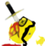
The Monster one
All these s***s are AI clearly tho
- Aug 18, 2023Sir Swagalot
why does the first cover look like the background to a target “back to school” advertisement
Looks like a birthday gift wrap
- Gojira 🦖Aug 18, 2023
wow he is insano!!!
 Aug 18, 2023
Second one is insano
Looks like something I would’ve done in middle school Aug 18, 2023
Was bout to say 3rd one looks cool and 4th one also looks kinda dope. Even the first 2 aren’t that objectively bad just not Cudi’s usual style and aesthetic and definitely kinda weird for mainstream hip hop. I could see a weird underground indie album that actually sounds decent having those covers though

 Aug 18, 20232words
All these are better than the Utopia art
Tell the truth for once
- Aug 18, 2023
 Nute
Nute  Aug 18, 2023
Trash covers
Trash album
Trash artist
 Mmm Hmm 😆Aug 18, 2023
3 the only one that matches the title
 Aug 18, 2023
3rd one is the best
 Aug 18, 2023Nute
- Aug 18, 2023
swindling his fans with shirt less pierced nipple pictures
 Aug 18, 2023!https://youtu.be/34P_EZ0n7eY
 Fivi
Fivi  Aug 18, 2023
INSANO covers Cudi!
Wicked Awesome art direction!
 Aug 18, 2023·1 replyTubig
This is f***ing hilarious man
What is he doing
He thinks he's sick innit 💀💀

