 Jun 11, 2021·edited


haven’t listened to the music yet but this s*** is f***in HARD.
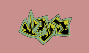
The negative space, the update of the old “ill” mark, the grids .. it’s like space graffiti
instagram.com/number3__?utm_medium=copy_link
check out the designer, he’s got real cool stuff even besides logos.
- Jun 11, 2021
wait can you not embed insta anymore
 Gojira 🦖Jun 11, 2021
hard as balls
 Jun 11, 2021·2 replies
Someone screencap I wanna see
 Jun 11, 2021·1 replybabylon sherm
Someone screencap I wanna see

- Jun 11, 2021nocturnal
Oh yeah its lookin nice
 Jun 11, 2021
He must be buzzing, dude's been an Aphex fan forever
- Jun 11, 2021
I jus need the album man
Butterflies and Too Bizarre some of my fav tracks oty
- Jun 11, 2021babylon sherm
Someone screencap I wanna see
updated op w grids
 Jun 11, 2021·2 replies
Meh. Nowhere near as ironic and memorable as Aphex's logo
- Jun 11, 2021·1 replyGoo
Meh. Nowhere near as ironic and memorable as Aphex's logo
ironic?
- Jun 11, 2021·1 replyfrank 2022
ironic?
LMaoo I meant to say iconic
 Jun 11, 2021·1 reply
huge w for skrillex
- Melz ⚜️Jun 11, 2021
Pretty dope

 Jun 11, 2021·1 reply
Anyone know know what program this guy uses?
 Jun 11, 2021·1 replySteady Mobbing
Anyone know know what program this guy uses?
illustrator most likely
- Jun 11, 2021·2 repliesGoo
LMaoo I meant to say iconic
well f***ing duh, it’s been out for 3 hours. Aphex twin logo is one of the most famous music logos in history..
- Jun 11, 2021frank 2022
well f***ing duh, it’s been out for 3 hours. Aphex twin logo is one of the most famous music logos in history..
Ofc so maybe it's just that but I tried to imagine a situation where that Skrilly logo becomes half as iconic and I can't
- Jun 11, 2021·2 repliesTheEPSD
illustrator most likely
I like how the lines are longer than the design itself. Is this how logo graphic designers usually make stuff?
- Jun 11, 2021·1 replySteady Mobbing
I like how the lines are longer than the design itself. Is this how logo graphic designers usually make stuff?
they often use those lines as rulers, yeah. i don't, but i'm not a professional.
he uses a lot of angles, perspective points, symmetry in his work. it's interesting. it's always cool to see the rulers of someone's design.
- Jun 11, 2021Steady Mobbing
I like how the lines are longer than the design itself. Is this how logo graphic designers usually make stuff?
yeah, gridding is a really common method that designers use to justify their decisions. Everyone from publication designers to type designers use them, but logo designers really tend to nerd out about the intricate geometries.
 NeonNigga23 ♻️Jun 11, 2021
this is nice
 Jun 11, 2021
Damn, that's fire.
 Jun 11, 2021godeadbedead
huge w for skrillex
This Is a Very Dope And Fire Logo NGL.
 Jun 11, 2021·2 replies
dont let ian connor see this