
 Dec 22, 2020
 ty4nothing
taking a picture from carti on stage is better than just copy a 70s cover with the same font and s*** just to pay "homage" lol
That pentagram looks cheap photoshopped in
- Dec 22, 2020·2 replies
 GloMide
Lol learn the difference between rip off and inspiration
my bad, i said it wrong
its a homage, but who cares
its not authentic in the end, my point is that a red cover of carti on stage is not any different from this cover  Dec 22, 2020
 nerdy
nerdyEDIT MY AVI AS THE COVER PLZZZZ
- Dec 22, 2020·1 reply
Are we sure this is coming Xmas 😅
 Dec 22, 2020
 allmygirlsdoyoga
Any of y’all know if Buffy still gonna be on here?
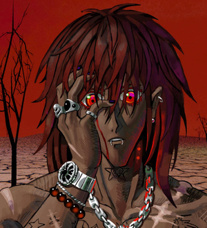
makes sense with the vampire aesthetic
- Dec 22, 2020·1 replyty4nothing
my bad, i said it wrong
its a homage, but who cares
its not authentic in the end, my point is that a red cover of carti on stage is not any different from this coverIdc but

 Vlonely 🦍Dec 22, 2020COWBOY WAYNE
Are we sure this is coming Xmas 😅
Yes

Why are people still skeptical lol
- Dec 22, 2020·1 reply
 Dec 22, 2020·1 replyty4nothing
taking a picture from carti on stage is better than just copy a 70s cover with the same font and s*** just to pay "homage" lol
If the album is really as punk as Carti is promoting it as, then the 70s punk mag homage is 100000% the better artwork.
And besides the stage pic looks way too reminiscent of the Die Lit cover but just red this time. Clearly Carti wants to separate the vibe and aesthetic of these two projects.
- Dec 22, 2020ghost
Thank you
- Dec 22, 2020
 Immaaterial
It has a concept behind and that's cool. Only thing I would change is the photo he used tbh
makes it look like he's got a Hitler mustache
- Dec 22, 2020Immaaterial
It has a concept behind and that's cool. Only thing I would change is the photo he used tbh
Nah pic he chose go hard as f***
- Dec 22, 2020·1 replyshaleirose
If the album is really as punk as Carti is promoting it as, then the 70s punk mag homage is 100000% the better artwork.
And besides the stage pic looks way too reminiscent of the Die Lit cover but just red this time. Clearly Carti wants to separate the vibe and aesthetic of these two projects.
frfr
i just want the music
 Dec 22, 2020
The 1987 propaganda poster
 Dec 22, 2020Goooooooooooo
Idc but
this 1 OD hard tho lol
- Dec 22, 2020
durkio goated
- Dec 22, 2020ty4nothing
my bad, i said it wrong
its a homage, but who cares
its not authentic in the end, my point is that a red cover of carti on stage is not any different from this coverIt’s way different
The actual cover is an homage to something else
The stage cover is a cheap and uninspired representation of the album’s title and Carti’s aesthetic
- Dec 22, 2020
The whole color scheme is so clean. Black and white with the red. Thank you Carti
- Dec 22, 2020·1 reply
- Dec 22, 2020ghost
Hard
 Dec 22, 2020ThemCLBniggasweak
Reposting

This would be a fire Deluxe cover.
Take an L
 Dec 22, 2020Wolf80
the funniest part is that the cover does carry that aesthetic - bro looking at us like a psychopath that finally found his prey
- Dec 22, 2020·1 reply
if casuals hating it’s a good sign
year from now theyll be acting like they loved it from the jump
 Dec 22, 2020ThemCLBniggasweak
Reposting
This would be a fire Deluxe cover.
Ban
- Dec 22, 2020
Stop posting s***ty covers
