 Updated Jan 11, 2022
Can you please make a clean nice artwork of this?
I really like the font, colors, it fits well with the black background, the text in nicely positioned, and feels just like the image of a radiostation.
At the same time, would be like a tribute to the Queen album, "Jazz" (for those unfamiliar, artwork below)I am able to remove the text above and below with delete/fill/content aware in photoshop, but I'd maybe like not f***ing up the waves below. Plus, maybe a more trained eye of someone who's been editing for some time, might reposition the text, etc. You know the drill.
Okay I'll shut up, if you got nothing better to do, work your magic. Thanks in advance!
(PS. the dawn pic is from amazon music's tweet, a 456KB 1500x1500 jpg, I don't know if this is the highest resolution there is, or if there's better, I literally clicked the first google result)
PPS. important, check comment #1 below for updates!

- Jan 11, 2022·edited
Ok, so I have searched and found these three.
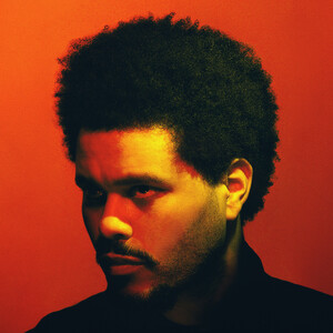
(info, source content, and link on each image as follows)from the weeknd tweet, an image of 2048x2048 jpg 545KB
i.imgur.com/EQZjfeS.jpgfrom amazon music tweet, an image of 1500x1500 jpg 455KB
i.imgur.com/gYnzlzo.jpgfrom the weeknd fb post 2048x2048 jpg 827KB
i.imgur.com/wAFxIyd.jpg(surprisingly facebook had the biggest filesize)
PS. just a heads up. The weeknd tweet and facebook has a sweeter/vintage/kinda grainy-ish black background, and different textWhile the amazon music, has a more clinical black background, and different text
Working with jpg file sources is a b****, but hey, for an artwork it's tolerable. Imma load these in photoshop and see what I can do with my beginner skills
- Jan 11, 2022
reserved
- Jan 12, 2022·edited
Current progress, idea candidates. Interestingly there are many combinations, but I guess tomorrow will come up with the final picks.
PS. Unfortunately I can't seem to remove the text from the sonar/waves without messing up the curves. (I don't know if Imma like it more or less without the text, but I guess I'll never know)
- Jan 12, 2022
Current progress and how it looks in the player

 Jan 12, 2022·1 reply
reworked the rings and added some light grain for texture + sharpened it up a bit :

- Jan 12, 2022AC
reworked the rings and added some light grain for texture + sharpened it up a bit :
ring spacing is a bit off tho might go back and polish up for you @op
- Jan 12, 2022·1 reply
updated

- Jan 12, 2022
yooo @AC thanks for stopping by! You're a wizard!
So jealous of skilled users that can weave nice edits with photoshop!
Btw how did you polish it? Comparing your edit to the facebook sourced pic, (which was the higher resolution and file size), and your pic makes the source file look like poverty haha
What about the grain effect? Cuz I'd maybe wanna try this look with the ring text too.
I don't wanna bother with many questions, or take up time, nonetheless, thank you once again! 🍻  Jan 13, 2022AC
updated
Good stuff!
- Jan 22, 2022
Alrighty then, I found the time to properly dedicate this.
Here's an album with a couple of options. There are different combinations, and slight but nice text positionings.PS. I even fixed the missing arch at the outer circle/ellipse from AC's cool edit (it was bothering the OCD side of me lol)
PS2. The source pic I worked on has a dark background that isn't true black.
I provided two pictures each for every edit. One has that, let's call it "warm" black, and the other has true black.Enjoy
- Jan 23, 2022·edited
Had another idea

