 Oct 13, 2020
Why did we allow this as a culture? S*** has 0 graphic design sense, it's all clickbait 9/10
 Oct 13, 2020
I agree . It's because they're marketed towards kids
 Oct 13, 2020·1 reply
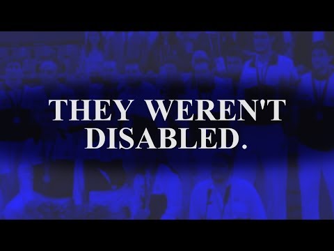
 Oct 13, 2020·1 reply
They're all just designed to pop as much as possible.
I've worked on projects where we need to deliver thumbnails and the more interesting, creative design doesn't really win it's just whatever is gonna get eyeballs in .02 seconds. Not even mad, it's f***ing youtube it doesn't need to be art, it's just what it is.
I've always thought YouTube in general is ugly as hell though.
- Oct 13, 2020rozco
They're all just designed to pop as much as possible.
I've worked on projects where we need to deliver thumbnails and the more interesting, creative design doesn't really win it's just whatever is gonna get eyeballs in .02 seconds. Not even mad, it's f***ing youtube it doesn't need to be art, it's just what it is.
I've always thought YouTube in general is ugly as hell though.
Yea but it's the same think with video game covers and movie posters.
It's the death of aestheticism for the commodification of clicks it's just weird how it's just dudes face and some red circles, like hell it's funny to think like story time vloggers don't even have a unique design template or something ya know
 Oct 13, 2020
Often the dope ones stays get poverty views lel
People just want to watch vids right away not appreciate thumbnails
 Oct 13, 2020·1 reply
I've thought about making a thread that lightly touches on this, specifically about if their is such a thing as "YouTube Trending Bait" music, and using thumbnails as a "aesthetic barometer" of sorts
- Oct 13, 2020·2 replies
:

Youtube thumbnails be like
IS 5G KILLING KIDS????
 Oct 13, 2020·1 reply
The basic white outline over people ones are alright when done correctly
I hate the 😱 faces they all do tho
Some of my friends make videos and their thumbnails are disgusting ...stretched out vertical pictures, arial font etc
 makes me not wanna support sometimes lmao
 Oct 13, 2020
Im sick of the gaming ones where they make the saturation like 999999999999999999999999999x times what the actual game looks like
 Oct 13, 2020
i hate the youtube monoculture
- Oct 13, 2020
i used to put solely anime characters as mine
- Oct 13, 2020Yeezydawg
The basic white outline over people ones are alright when done correctly
I hate the 😱 faces they all do tho
Some of my friends make videos and their thumbnails are disgusting ...stretched out vertical pictures, arial font etc
makes me not wanna support sometimes lmaoTheyre just a level of irony above you bro dont take it personally
 blase 🦋Oct 13, 2020·1 reply
Youtube 2006-2010 >>>
 Oct 13, 2020blase
Youtube 2006-2010 >>>
 Oct 13, 2020·4 replies
- Oct 13, 2020POOM POOM DOOM
I've thought about making a thread that lightly touches on this, specifically about if their is such a thing as "YouTube Trending Bait" music, and using thumbnails as a "aesthetic barometer" of sorts
Im not big on YouTube overall, but watch the occasional video. Casey Neistat comes to mind for the thumbnail topic. Idk how he is now versus before though.
 sace 👍Oct 13, 2020
 Oct 13, 2020disneyfrozen
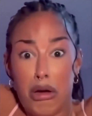
:
Youtube thumbnails be like
IS 5G KILLING KIDS????
This looks like one of those images they show you to see what having a stroke feels like
 Oct 13, 2020·1 reply
they are fire. Completely shameless and to the point. They get rid of all the unnecessary information. It reminds me of early webstores use to look in their simplicity
- Oct 13, 2020·1 replydisneyfrozen
:
Youtube thumbnails be like
IS 5G KILLING KIDS????
Looks dope who did this?
- Oct 13, 2020·1 replyMonky business
they are fire. Completely shameless and to the point. They get rid of all the unnecessary information. It reminds me of early webstores use to look in their simplicity
"I think they're fire" s*** I've seen 8th grade power points that look batter than these
Like I get the memey ones but the trends done in that site with the bold stroke/outlines god afwul fonts have to stop. It's like not even in line with graphic design trends that's why it boggles my mind and intrigues me so much
- Oct 13, 2020·1 replyPleaseDelete
Looks dope who did this?
idk it was just in my phone
- Oct 13, 2020disneyfrozen
"I think they're fire" s*** I've seen 8th grade power points that look batter than these
Like I get the memey ones but the trends done in that site with the bold stroke/outlines god afwul fonts have to stop. It's like not even in line with graphic design trends that's why it boggles my mind and intrigues me so much
ok this genre of thumbnails is trash but the giant red circle and arrow era in 2016 was goated

- Oct 13, 2020disneyfrozen
idk it was just in my phone
Usually trash youtubers also got trash thumbnails


