 Aug 27, 2020·1 reply
 YA ICEMAN ACE
Anyone else think that text block is wildly corny?

 Aug 27, 2020·1 replyAPEXR
LMAOOOO
I see shirts like this all the time while shopping at Zumiez. Like who seriously buys shirts like this?
- Aug 27, 2020·1 replyOak
LMAOOOO
I see shirts like this all the time while shopping at Zumiez. Like who seriously buys shirts like this?
ripped that pic from zumies website

 Aug 27, 2020·edited·1 replyYA ICEMAN ACE
Anyone else think that text block is wildly corny?
Hopefully it makes more sense when we hear the project
But for now yes lol
 Aug 27, 2020APEXR
ripped that pic from zumies website
LOL
- Aug 27, 2020RE1GN
Hopefully it makes more sense when we hear the project
But for now yes lol
yooo
 Vietbrah 😈Aug 27, 2020
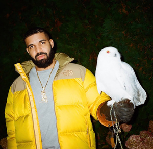 nonamestreets14
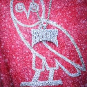
Glad the Forza Nocta name being used in some way

 Aug 27, 2020Vietbrah
So theories were right
CLB = album title
Nocta = Nike collabThose were not the theories...where yall album title detectives at?
- CKL TML 🌺Aug 27, 2020·2 replies
Thats cool and all but when are we getting the fragrances
 Aug 27, 2020CKL TML
Thats cool and all but when are we getting the fragrances
I forgot about that bruh drizzy so miles ahead of these other artist it’s not even fair or funny anymore at this point if he gives the men and women cologne fragrances to go with this merch and the candles too that he got trademarked sheesh I hope so if not he leaving a lot of money on the table cause everytime I check twitter everyone and there momma want this CLB merch
- Aug 27, 2020·1 replyCKL TML
Thats cool and all but when are we getting the fragrances
whenever drake decides to meet up with jeremy fragrance and waits for the double spin as a sign of approval.
- CKL TML 🌺Aug 27, 2020voodoo
whenever drake decides to meet up with jeremy fragrance and waits for the double spin as a sign of approval.
Jeremy gon kill drek with the one handed pushups
 Aug 27, 2020
So now I need a Nocta x OVO x Nike collab ffs
 Aug 27, 2020
Just need a CLB hoodie and a couple of the candles and I'm straight.
EDIT: I need that black hat he's been teasing as well.
 Aug 27, 2020·1 reply
soooo is this is his version of the Scorpion billboards where he previewed some lyrics? lol
 Aug 27, 2020·1 replyprovider
soooo is this is his version of the Scorpion billboards where he previewed some lyrics? lol
Yep
- Aug 27, 2020·1 replyCLB 95WAVV
Yep
ok i need the rest of the album to see why LNCL as the lead single makes sense lol
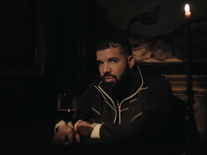
- Aug 27, 2020·edited·3 repliesYA ICEMAN ACE
Anyone else think that text block is wildly corny?
For real. Just seeing what is in that text block just calls Drake's whole sense of taste into question to me LOL... it's just like the Scorpion jackets, kind of hard before the album dropped and then the album dropped and you realize these jackets are literally worthless. So many of Drake's efforts in the arena of visuals betray his fundamental conservativism and lack of visual imagination and just lack of good design period... like the f***ing OVO radio covers half of which had completely illegible text and atrocious color combinations... some of the new OVO merch is kind of hard but seriously bring it back to that s*** Public Library was doing for him back in 2013, arguably the last era of consistently fairly solid Drake design. Not to mention that godawful blocky font that was used in the "Take Care" era... like seriously Weeknd's design just blows Drake out of the water in every way, just to use a random example. Nike and cars does not an aesthetic make... half of Drake's aesthetic is just taking pictures of rich people s*** that is well-designed but that neither he nor anyone on his team did anything to make look actually visually impressive beyond just the flex factor
- Aug 27, 2020·1 replyTheCollector
For real. Just seeing what is in that text block just calls Drake's whole sense of taste into question to me LOL... it's just like the Scorpion jackets, kind of hard before the album dropped and then the album dropped and you realize these jackets are literally worthless. So many of Drake's efforts in the arena of visuals betray his fundamental conservativism and lack of visual imagination and just lack of good design period... like the f***ing OVO radio covers half of which had completely illegible text and atrocious color combinations... some of the new OVO merch is kind of hard but seriously bring it back to that s*** Public Library was doing for him back in 2013, arguably the last era of consistently fairly solid Drake design. Not to mention that godawful blocky font that was used in the "Take Care" era... like seriously Weeknd's design just blows Drake out of the water in every way, just to use a random example. Nike and cars does not an aesthetic make... half of Drake's aesthetic is just taking pictures of rich people s*** that is well-designed but that neither he nor anyone on his team did anything to make look actually visually impressive beyond just the flex factor
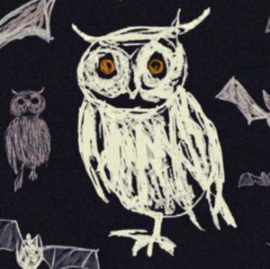
And half of Drake's CGI visuals are pretty worthless too when you compare them to stuff that is actually cohesive like the Pop Smoke spotify canvases, all of Weeknd's s***, etc. That "Greece" owl thing was pretty stupid and the Time Flies visual, while cool, was really nothing that that artist hasn't done before and the concept of just filming Drake in and on top of a car was nothing exciting.
That "aubrey/3 migos tour" CGI visual was pretty dope but still it was all the artist's doing, the subject matter was pretty lame as far as showing drake's stage show, a scorpion busting out of the stage, etc. like seriously that level of video would have been cool no matter what artist's music and aesthetic they used for it.
- Aug 27, 2020·1 replyTheCollector
And half of Drake's CGI visuals are pretty worthless too when you compare them to stuff that is actually cohesive like the Pop Smoke spotify canvases, all of Weeknd's s***, etc. That "Greece" owl thing was pretty stupid and the Time Flies visual, while cool, was really nothing that that artist hasn't done before and the concept of just filming Drake in and on top of a car was nothing exciting.
That "aubrey/3 migos tour" CGI visual was pretty dope but still it was all the artist's doing, the subject matter was pretty lame as far as showing drake's stage show, a scorpion busting out of the stage, etc. like seriously that level of video would have been cool no matter what artist's music and aesthetic they used for it.
I'm just going to keep going off and say that almost all of Drake's good visuals have come from someone who is already well-established and proven at making dope s*** in their own style... like Virgil with the plane decoration, etc. "take care's" cover art was the only visual I can think of involving Drake that is aesthetically pleasing, very much Drake stylistically in terms of what makes it visually work (as opposed to the artist's style just being applied to Drake like the 'hotline bling' video), and is not poorly done in some manner or another (like the 'Views' cover photoshop job).
and drake's f***ing text treatments are so lousy and boring, nine times out of 10... when they're not just a complete mess
 Aug 27, 2020·1 replyTheCollector
I'm just going to keep going off and say that almost all of Drake's good visuals have come from someone who is already well-established and proven at making dope s*** in their own style... like Virgil with the plane decoration, etc. "take care's" cover art was the only visual I can think of involving Drake that is aesthetically pleasing, very much Drake stylistically in terms of what makes it visually work (as opposed to the artist's style just being applied to Drake like the 'hotline bling' video), and is not poorly done in some manner or another (like the 'Views' cover photoshop job).
and drake's f***ing text treatments are so lousy and boring, nine times out of 10... when they're not just a complete mess
Ok pal, you done with your rant?
 Aug 27, 2020·edited·1 replyCLB aryan
Ok pal, you done with your rant?
a block of text got this man suicidal
- Aug 27, 2020ovosound
a block of text got this man suicidal

- Aug 27, 2020TheCollector
For real. Just seeing what is in that text block just calls Drake's whole sense of taste into question to me LOL... it's just like the Scorpion jackets, kind of hard before the album dropped and then the album dropped and you realize these jackets are literally worthless. So many of Drake's efforts in the arena of visuals betray his fundamental conservativism and lack of visual imagination and just lack of good design period... like the f***ing OVO radio covers half of which had completely illegible text and atrocious color combinations... some of the new OVO merch is kind of hard but seriously bring it back to that s*** Public Library was doing for him back in 2013, arguably the last era of consistently fairly solid Drake design. Not to mention that godawful blocky font that was used in the "Take Care" era... like seriously Weeknd's design just blows Drake out of the water in every way, just to use a random example. Nike and cars does not an aesthetic make... half of Drake's aesthetic is just taking pictures of rich people s*** that is well-designed but that neither he nor anyone on his team did anything to make look actually visually impressive beyond just the flex factor
Alright dawg I didn't ask for all that

 Aug 27, 2020·1 replyprovider
ok i need the rest of the album to see why LNCL as the lead single makes sense lol
Huh? LNCL is already gold and it’s doing great. That’s why it’s the lead single lmao.