 Jan 16, 2021
helmut lane
3rd and 4th fit too good
 Jan 16, 2021·2 replies
i already voted but specifics since we doing that :elon:
helmut
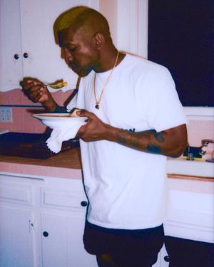
1. i dont think that jacket goes well w the pants at all.. the pants are a bit shapeless and since the jackets also slightly bulky it kinda makes it look like something u just threw on to go 2 the store esp since the shoes dont realy go w the vibe, i think a converse or boot wlda been nicer than a basic running sneaker... nor am i rly a fan of how the top half of the fit was layered...
something about the unzipped quarter zip and kinda slightly flopped open collar looks sloppy to me
2. i wld leave the jacket unzipped.... it kinda looks stiff to me rn n a lil uncomfi. i think a boot wld look nicer as well, and it would go with the motorcycle jacket's vibe
3. i liked this, i like the way the sweatshirt kinda ?billows out? and the shape that creates against the pants
4. i like this a lot, its v funmilhouse
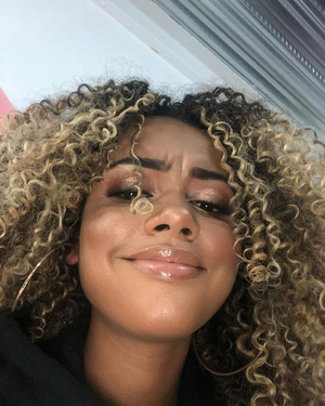
1. maybe im biased, but i just really dont like the graphic animal prints u use/the way u use them across your fits. the gray leopard print with the bright purple hats kinda serving me early 2000s lmfao party rock vibes
2. i like the way the white shirt peeks behind the sweater, it makes it look a lot more polished than otherwise. the jacket is nice as well. im just not really into the color combinations, i think a cream or tan or even denim pant would be more complementary w the brown
3. the zebra print facemask really clashes with the sweaters graphic 2 me eifjoiw. i do like the color combo of the orange vest, the green shoes, and the blue pants, but i dont know how i feel abt the sweater in that mix. i personally find it a little jarring--i think like a green/cream sweater w a less busy pattern wld b more ideal in my mind
4. i think this is my fave fit, but its not really groundbreaking 2 me. i fl the leopard print facemask cld go--i think the basic ass disposable mask wld make a nice lil color choice given the shoes, but i think the current one doesn't really bring the hat and the rest of the fit's colors 2gether, it kinda focuses too much of my attention Jan 16, 2021
 Anna
Annaprops to helmut, just think his fits look sloppy, while milhouse really got his proportions on lock
^
Milhouse
- Jan 16, 2021·1 replyi am sasuke
i already voted but specifics since we doing that :elon:
helmut
1. i dont think that jacket goes well w the pants at all.. the pants are a bit shapeless and since the jackets also slightly bulky it kinda makes it look like something u just threw on to go 2 the store esp since the shoes dont realy go w the vibe, i think a converse or boot wlda been nicer than a basic running sneaker... nor am i rly a fan of how the top half of the fit was layered...
something about the unzipped quarter zip and kinda slightly flopped open collar looks sloppy to me
2. i wld leave the jacket unzipped.... it kinda looks stiff to me rn n a lil uncomfi. i think a boot wld look nicer as well, and it would go with the motorcycle jacket's vibe
3. i liked this, i like the way the sweatshirt kinda ?billows out? and the shape that creates against the pants
4. i like this a lot, its v funmilhouse
1. maybe im biased, but i just really dont like the graphic animal prints u use/the way u use them across your fits. the gray leopard print with the bright purple hats kinda serving me early 2000s lmfao party rock vibes
2. i like the way the white shirt peeks behind the sweater, it makes it look a lot more polished than otherwise. the jacket is nice as well. im just not really into the color combinations, i think a cream or tan or even denim pant would be more complementary w the brown
3. the zebra print facemask really clashes with the sweaters graphic 2 me eifjoiw. i do like the color combo of the orange vest, the green shoes, and the blue pants, but i dont know how i feel abt the sweater in that mix. i personally find it a little jarring--i think like a green/cream sweater w a less busy pattern wld b more ideal in my mind
4. i think this is my fave fit, but its not really groundbreaking 2 me. i fl the leopard print facemask cld go--i think the basic ass disposable mask wld make a nice lil color choice given the shoes, but i think the current one doesn't really bring the hat and the rest of the fit's colors 2gether, it kinda focuses too much of my attentionOh nah he said lmfao party rock 😭😭😭
- Jan 16, 2021·1 replyHXNS
Oh nah he said lmfao party rock 😭😭😭
ofwajeifo i dont wanna be mean but
 its just the combo of hypersaturated color and then a graphic animal print ok
  Jan 16, 2021
 Firmaments
Gonna have to go with Milhouse for this one. Every was so well executed. Fit is on point in everything and his cholor-schemes are great. His 4th fit was my favorite of the round.
Helmut Lame is really progressing though. His 3rd fit was probably my 2nd favorite this round (that or MILHOUSE's 2nd).
Some critiques for @helmut_lame
1st fit:
Top half is really nice but the bottom is kind of bland. You have on black Visvim Mocs, yea (or am I tripping)? The way they are worn here kind of makes them look like a cheap tennis shoe. They would work better with something like a slim patchwork jean that shoes them off a bitter more. Pleated suit pants with a loafer might look nice here.2nd fit:
This is really nice. Just the shoes are letting it down a bit. A more interesting combat boot would look cool. Some Ann D Scamosciato shoes might work well here too.3rd fit:
You honestly nailed this. Might like to see it without the baseball hat, though.4th fit:
Proportions on this are off, but it wouldn't really take much to nail them. The oversized jacket and the boots would work better with longer/baggier/bulkier pants.agree with all this feedback. exactly my thoughts on all 4 fits
 Jan 16, 2021·1 replyi am sasuke
i already voted but specifics since we doing that :elon:
helmut
1. i dont think that jacket goes well w the pants at all.. the pants are a bit shapeless and since the jackets also slightly bulky it kinda makes it look like something u just threw on to go 2 the store esp since the shoes dont realy go w the vibe, i think a converse or boot wlda been nicer than a basic running sneaker... nor am i rly a fan of how the top half of the fit was layered...
something about the unzipped quarter zip and kinda slightly flopped open collar looks sloppy to me
2. i wld leave the jacket unzipped.... it kinda looks stiff to me rn n a lil uncomfi. i think a boot wld look nicer as well, and it would go with the motorcycle jacket's vibe
3. i liked this, i like the way the sweatshirt kinda ?billows out? and the shape that creates against the pants
4. i like this a lot, its v funmilhouse
1. maybe im biased, but i just really dont like the graphic animal prints u use/the way u use them across your fits. the gray leopard print with the bright purple hats kinda serving me early 2000s lmfao party rock vibes
2. i like the way the white shirt peeks behind the sweater, it makes it look a lot more polished than otherwise. the jacket is nice as well. im just not really into the color combinations, i think a cream or tan or even denim pant would be more complementary w the brown
3. the zebra print facemask really clashes with the sweaters graphic 2 me eifjoiw. i do like the color combo of the orange vest, the green shoes, and the blue pants, but i dont know how i feel abt the sweater in that mix. i personally find it a little jarring--i think like a green/cream sweater w a less busy pattern wld b more ideal in my mind
4. i think this is my fave fit, but its not really groundbreaking 2 me. i fl the leopard print facemask cld go--i think the basic ass disposable mask wld make a nice lil color choice given the shoes, but i think the current one doesn't really bring the hat and the rest of the fit's colors 2gether, it kinda focuses too much of my attentionparty rocker's in the house tongiht!!
- Jan 16, 2021mythic
I really like helmut's fourth fit, I think its a very effective all-surplus look. But my vote has to go to the magnificent Milhouse . The subtlety in texture, pattern, and colour co-ordination in all of his fits is masterful. The blue Adidas trainers with the tiger stripe trousers alone is

he’s a dreamboat
 Jan 16, 2021
MILHOUSE
- Jan 16, 2021·1 replyi am sasuke
ofwajeifo i dont wanna be mean but
its just the combo of hypersaturated color and then a graphic animal print oka top 5 fit from SW so far for me
- Jan 16, 2021·1 replymythic
I really like helmut's fourth fit, I think its a very effective all-surplus look. But my vote has to go to the magnificent Milhouse . The subtlety in texture, pattern, and colour co-ordination in all of his fits is masterful. The blue Adidas trainers with the tiger stripe trousers alone is
the magnificent milhouse and gary givenchy
- Jan 16, 2021
hope yall got filters under those cloth masks 🤞🏻
- Jan 16, 2021superhans
a top 5 fit from SW so far for me
if the hat went... i think i cld relax
i think a hat the color of his orange vest wld b cute, one the color of the denim jacket he has wld b cute but
- Jan 16, 2021·2 repliessuperhans
the magnificent milhouse and gary givenchy
mixing the Bart Balmain with the Ronald Rick Owens
- Jan 16, 2021mythic
mixing the Bart Balmain with the Ronald Rick Owens
 Jan 16, 2021
Millhouse
 Jan 16, 2021
millhouse
 Jan 16, 2021
Helmut got the pieces but theres still something a bit unrefined about his style tbh
I think playing around with different bottoms and/or footwear would have elevated some of these because theres something too tame and monotonous about them. The third fit is my favorite one here its lot more interesting than the others and pants are a nice pop. The fourth fit is a bit too top heavy for me and I think larger/wider bottoms would level it up but I like the bunny boots here
Milhouse is colorblocking is always fire. Cool to see the way he plays with colors or patterns and use them in ways that don't traditionally "work" with each other. I think my only issue is the 3rd fit because I like the leopard and camo print in the 4th but the zebra pattern and knit are a little too jarring for me and I wouldve liked a simpler top but i f*** with the risks

so overall Milhouse
 Jan 16, 2021
Everyone basically said what I was thinking. Good job to both but I’m going with MILHOUSE
 Jan 16, 2021
helmut
 Jan 16, 2021
milhouse
 Jan 17, 2021
milhouse
@helmut_lame your 4th fit my fav of this round tho and that teal shearling jacket is nice.
@MILHOUSE orange vest second overall fav, colors balance out nicely from top to bottom (as with your others), you never miss.
 Jan 17, 2021
thread real asl today
 OPJan 17, 2021·2 replies
 Oscar Winner
Helmut gotta do something about that hair
Chill im growing it out
 Jan 17, 2021helmut
Always happy to have critique in the thread

you got this man you been making progress at a very good pace