 May 30, 2020
i’m proposing a simplified, textless Parental Advisory Logo:

the PAL has undergone a semiotic shift; it is ubiquitous while still so distinct that its unmistakable black-and-white rectangular bars alone communicate their inscribed warning
through repetition and hyper-visibility, this cautionary message has infused into the symbol itself, thus trivializing the need for any further clarification via text
just like how a plain red octagon has come to signify 'STOP', the PAL no longer requires an overt explanation to succeed as a functional warning label
in a globalized world, symbols have become the universal meta-language, and a label with text is nothing more than a vestige of a regionalized past


 May 30, 2020·2 replies
Nah, that looks horrible
 May 30, 2020·edited
i’m with it
not the one you made though lol it looks funny
 May 30, 2020·1 reply
the text might not be necessary but I don't see any reason to get rid of it it's so iconic as is
the replacement icon's proportions are off too doesn't look right
 May 30, 2020scihoi
the text might not be necessary but I don't see any reason to get rid of it it's so iconic as is
the replacement icon's proportions are off too doesn't look right
“Explicit Lyrics > Explicit Content”
 May 30, 2020
Looks awful, like a random blemish
- OPMay 30, 2020·1 reply
whether on a desktop or mobile app, album covers are rarely displayed in the dimensions of their CD counterparts on Spotify and Apple Music. today’s music services have opted to shrink album artwork in order to optimize viewing for laptop and smartphone displays
as songs became detached from their once physical essence with the rise of digital consumption and streaming, their corresponding artwork was relegated to a mere hyperlink in a mosaic of mini icons:

the PAL however was never refined to take into account these new spatial restrictions. this has resulted in a compressed parental advisory label whose now cramped and grainy text dims its trademarked black and white field
transitioning to a minimalistic PAL would amend this issue by sharpening the sticker’s contrast and removing this excess clutter. it is the logical progression for the parental advisory label:

 May 30, 2020·1 reply
Looks very s***ty, ban OP
 May 30, 2020
I liked when albums didn’t have this
- May 30, 2020zzounn
whether on a desktop or mobile app, album covers are rarely displayed in the dimensions of their CD counterparts on Spotify and Apple Music. today’s music services have opted to shrink album artwork in order to optimize viewing for laptop and smartphone displays
as songs became detached from their once physical essence with the rise of digital consumption and streaming, their corresponding artwork was relegated to a mere hyperlink in a mosaic of mini icons:
the PAL however was never refined to take into account these new spatial restrictions. this has resulted in a compressed parental advisory label whose now cramped and grainy text dims its trademarked black and white field
transitioning to a minimalistic PAL would amend this issue by sharpening the sticker’s contrast and removing this excess clutter. it is the logical progression for the parental advisory label:
It’s still a pass from me

- OPMay 30, 2020·2 replies
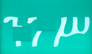
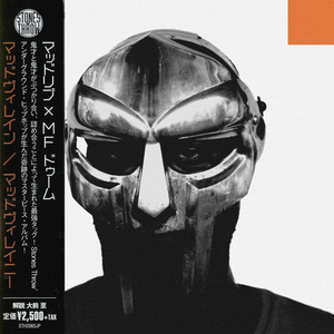
in recent years, many visual artists have minimized the Parental Advisory Label itself on their album cover designs. whether for stylistic purposes, or just to hide the sticker, the PAL of today has become relatively microscopic when compared to that of its 2000s counterparts:


couple this minimization with the previously mentioned smaller album displays, and the text on the PAL becomes virtually illegible
the new PAL i’m proposing would especially flourish in this undersized format. here’s a side by side comparison of a few recent album covers with tiny parental advisory stickers that would benefit from a text-free PAL replacement:


 May 30, 2020
man it's too iconic I would be very sad to see it go
- May 30, 2020
Cool idea but nah
 May 30, 2020
I like it
 May 30, 2020
Might be better without the border.
Other than that, the original is way too iconic.
 May 30, 2020
Bruh at least change proportions to correct ones lmao
- OPMay 30, 2020


 May 30, 2020
i like the idea, though id rather completely be rid of the the thing. also the outline is unnecessary in most cases
 May 30, 2020
Nah
- May 30, 2020·3 replies
Fw the creative drive though
- May 30, 2020
I like the see through parental advisory that a lot of modern albums / singles have
- May 30, 2020
no but keep going!!!!
- May 30, 2020
Interesting idea. I wouldn’t be opposed
 May 30, 2020
This looks like s*** stop wasting your time