 Jul 4, 2024·edited
I'll be releasing my first album soon and I came up with these 4 cover options.
The genre of the album is more soft hip-hop/jazz hip-hop/experimental. It gets around the idea of flowers because it's the main theme of the first track.
Artistically, which of these 4 do you like the most as an album cover?
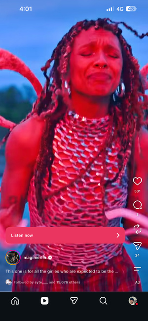
1:

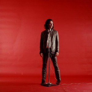
2:

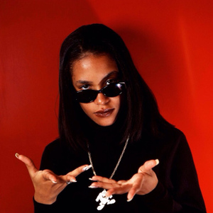
3:

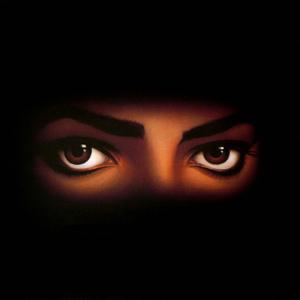
4:

 Jul 4, 2024·1 replySkinnyJeansKing· edited
I'll be releasing my first album soon and I came up with these 4 cover options.
The genre of the album is more soft hip-hop/jazz hip-hop/experimental. It gets around the idea of flowers because it's the main theme of the first track.
Artistically, which of these 4 do you like the most as an album cover?
1:
2:
3:
4:
2 of the pictures don’t load
 Jul 4, 2024
I guess the last one? I don't think I’d listen to any of them off the cover alone OP, just tryna be constructive
 Jul 4, 2024·5 replies
pay a real graphic designer
- Jul 4, 2024MyLeftBrain
2 of the pictures don’t load
Thank you for letting me know, just fixed it
- Jul 4, 2024Pinhead
pay a real graphic designer
If I couldn't pay one which one would choose from these options?
 Jul 4, 2024·2 replies
I like the first one even though it's kinda new order clone looking
But the fonts you pick give more Hallmark cards than cool music albums
Keep the fonts basic or just don't add fonts because the aesthetics don't mix well
- Jul 4, 2024
The second one is best even though I don't like the picture but just because the fonts aren't ugly
Change the font on the first one and then it's better
- Jul 4, 2024Pinhead
pay a real graphic designer
 Jul 4, 2024
I choose 4
1 there's something off, 2 looks like a book cover and 3 is no good- Jul 4, 2024·1 reply
1 but with a more normal front, like on 2
- Jul 4, 2024
4 looks like a classic
- Jul 4, 2024Pinhead
pay a real graphic designer
pick one pinhead
 Jul 4, 2024
sorry but none of these are it. they all give off amateur designer vibes
 Jul 4, 2024
2
but you need better fonts or none at all
you only get one first album put some time in on the cover go take some photos- Jul 4, 2024
that said number 1 is the best but pick a different font and better placement for the text
 Jul 4, 2024
First one seem fine and the 3rd one too but the font in both just feel like it don't fit for that. 1st one got that feeling that kinda wanna check the album but others dont really have that for me. so 1st without that font.
- Jul 4, 2024MyLeftBrain
1 but with a more normal front, like on 2
But I would buy some flowers myself and take a photo of them. You get more of an edge into the photos and you could place them in a cool setting. I think that is how you will get the best art(I am assuming these are stock photos)
 Jul 4, 2024
#1 is the best
 Jul 4, 2024
1 or 2, but the font needs to change
 Jul 4, 2024
1 or 3 but please remove the text
 Jul 4, 2024
1 looks kind of like an Italian restaurant menu, 2 looks like a chemistry textbook, 3 just isn't it, and 4 is eye-catching but still feels very stock photo-esque, like a coffee shop default CD
I'm not trying to be an a****** at all OP, but for your own sake I'd really recommend going back to the drawing board, it's important to have eye-catching and thematically appropriate artwork, but I don't think these options work, and it's not worth undercutting your art because you've decided these are the only options you have right now
 Jul 4, 2024
They look like book covers, croadie
- Jul 4, 2024
These covers are horrible fam, just being honest
 Jul 4, 2024
Ngl you dont want to be using canva for something like this