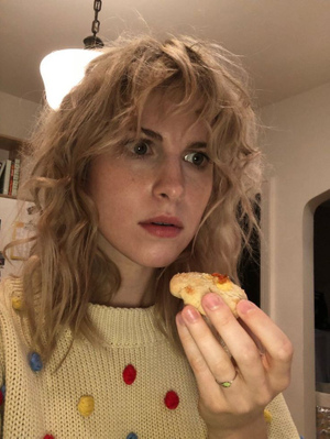
The main issue with a lot of these is they have no texture or the textures are off
Like 1 is a good idea but the grainy texture of the back ground pic doesn’t match the clean and vibrant white text
You need to texturize these some way thoroughly
First one is beautiful. I added some small details to further surface rather tearful emotions that I believe go along with the image.
Best of luck.

 Br00ses
I like the first one even though it's kinda new order clone looking
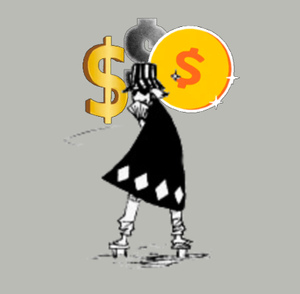
But the fonts you pick give more Hallmark cards than cool music albums
Keep the fonts basic or just don't add fonts because the aesthetics don't mix well
#1 but yeah, do something about that text @op
 Niggamortis
First one is beautiful. I added some small details to further surface rather tearful emotions that I believe go along with the image.
Best of luck.

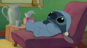
Do the sassy Drake pic like Danny did with the Disintegration cover
@op take off the text on all of these options. these fonts are not working for you. if you absolutely want text on there simple and small is best. in the helvetica realm is best
 Experiment626
The main issue with a lot of these is they have no texture or the textures are off
Like 1 is a good idea but the grainy texture of the back ground pic doesn’t match the clean and vibrant white text
You need to texturize these some way thoroughly
yeah @op the texture layers go on last think of it like compression it glues your layers together
personally i’d do the second one no text. text was on album covers so that they could be identifiable in stores there’s no real purpose for them now
 Br00ses 🐣Jul 4, 2024·1 reply
 Mark Moschino
personally i’d do the second one no text. text was on album covers so that they could be identifiable in stores there’s no real purpose for them now
Yeah pretty much unless the text adds to the design (it doesn't here) leave it off
 Br00ses
Yeah pretty much unless the text adds to the design (it doesn't here) leave it off
yeah there’s no need for it here, if he wants to way rethink the text then i could see it but what he has he’d be better off just jettisoning it
First ones the best, second one maybe but the text font takes away from it for me
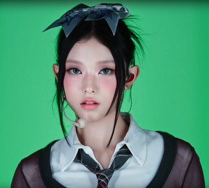
Third one looks like a book cover and fourth one is just not it
this just look kinda stock image-y, make something that says something about you or the album
I also think these could be decent if you went with a more classic font
 lil ufo 🛸Jul 4, 2024·1 reply
 Mark Moschino
font still bad my guy
initially I wanted to go times new roman but I will wait on op to decide


