 Jul 4, 2024
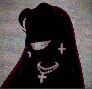 lil ufo
@op


I wouldn’t mind this just without the text tbh pretty nice
 Jul 4, 2024lil ufo
initially I wanted to go times new roman but I will wait on op to decide
helvetica
 Gangy 🇨🇳Jul 4, 2024
2
 Jul 4, 2024
Get a graphics designer bro. Your art is your legacy
 Jul 4, 2024
 Pinhead
pay a real graphic designer
 proper 🔩Jul 4, 2024·1 reply
- proper 🔩Jul 4, 2024Mark Moschino
font still bad my guy
 Jul 4, 2024
Any way you can remove that texture on the first image?
Not a fan of the font but a cleaner version of image 1 with your text (if you need it) in the upper left corner would work for me on first glance
I agree with collabing with an artist though
 Jul 4, 2024
These fonts are hideous
 Jul 4, 2024·1 replylil ufo
@op
Amazing man, can you just change the font to a cleaner version maybe?
- Jul 4, 2024·1 replyproper
Thank you man, maybe can you just add the “Todo dia, flores” and “Alessandro Fafer” somewhere with a better font than mine?
 Jul 4, 2024
#1 without the font would be hard
 Jul 4, 2024·edited
Pay me and I’ll cook for ya
liamramus.design
 Jul 4, 2024·1 reply
Você é brasileiro?
 Jul 4, 2024
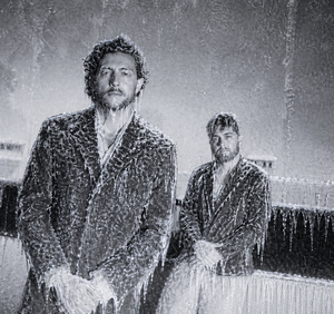
2 easily
- Jul 4, 2024
 Bro0o0ses
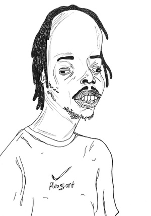
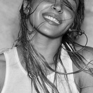
I like the first one even though it's kinda new order clone looking
But the fonts you pick give more Hallmark cards than cool music albums
Keep the fonts basic or just don't add fonts because the aesthetics don't mix well
The fonts are the weak point for sure
- lil ufo 🛸Jul 4, 2024·1 replySkinnyJeansKing
Amazing man, can you just change the font to a cleaner version maybe?
which one?
 Jul 4, 2024·2 repliesSkinnyJeansKing
Thank you man, maybe can you just add the “Todo dia, flores” and “Alessandro Fafer” somewhere with a better font than mine?
he's messing wit ya brodie that's the album cover for Taku - Songs To Break Up To

- Jul 4, 2024
 Niggamortis
First one is beautiful. I added some small details to further surface rather tearful emotions that I believe go along with the image.
Best of luck.

Bruh u defo the funniest poster
Lowkey the only one keeping the tradition alive
 Jul 4, 2024
2 easily
The others look amateur
- Jul 4, 2024
Last one not that bad either I guess
- proper 🔩Jul 4, 2024f_e_n_n_y
he's messing wit ya brodie that's the album cover for Taku - Songs To Break Up To
lmfsoo used to rap to these beats all the time
- Jul 4, 2024
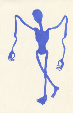
1 one no text
Maybe just your name