 Apr 25, 2023·2 replies
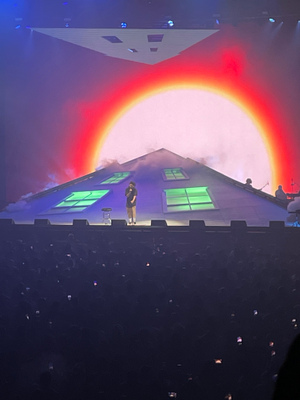 Gabagool Mentality
Hit or miss?

DROP the vid lol
i never seen this version ghosting ®️Apr 25, 2023
 Smacked Voodoo
Man this a lot to do about nothing lmao
respectfully im not taking app opinions from a mf with a tablet laptop

 Apr 25, 2023
sooo ugly now wtf
apple music wins once again tho
 Apr 25, 2023·2 repliesghosting
ya to a max of 5 cards across, which is awful
who scrolled through playlists on the left, it was just the navigation before?
nah I usually scroll through playlists on the left and you can only see 3 playlists at a time if the album art is maximized on a 13 in computer, sucks ass. seems like they just made it a bit better to use and sort/filter. at a minimum doesn't seem worse than before?
- ghosting ®️Apr 25, 2023·1 reply
 kyzer kta
you'll get used to it
and then they'll change it again
ok?
- Apr 25, 2023
 Magenta
what the f*** !!!!
goat cover picture
and nathan is the mf goat - ghosting ®️Apr 25, 2023·1 replyGIO GIO
nah I usually scroll through playlists on the left and you can only see 3 playlists at a time if the album art is maximized on a 13 in computer, sucks ass. seems like they just made it a bit better to use and sort/filter. at a minimum doesn't seem worse than before?
wym, the left side didnt even have any album art before this update
 OPApr 25, 2023
Wow is this gonna be my first hit thread?
- ghosting ®️Apr 25, 2023·1 reply
organizing folders was way easier like this, which is annoying bc all my playlists are organized into folders

- Apr 25, 2023·1 replyghosting
ok?
don't sas me
- Apr 25, 2023·1 replyghosting
wym, the left side didnt even have any album art before this update

you could scroll through playlists, they just expanded it to include albums and other s*** - ghosting ®️Apr 25, 2023·1 replyGIO GIO
you could scroll through playlists, they just expanded it to include albums and other s***u just gotta zoom out I think bruh
- Apr 25, 2023·1 replyghosting
u just gotta zoom out I think bruh
I'm at 100%, I don't have an issue with it. I'll I'm saying is it's not that different, seems like an improvement
 Apr 25, 2023
how you make this thread an include NO images in the OP? ktt fell off!!!
- ghosting ®️Apr 25, 2023·1 replykyzer kta
don't sas me
are you just in here to argue about nothing ?
- ghosting ®️Apr 25, 2023·1 replyGIO GIO
I'm at 100%, I don't have an issue with it. I'll I'm saying is it's not that different, seems like an improvement
ya if you go less you can see way more
also its very different and a downgrade based on how I use the app
not different from mobile tho since its literally just a copy of that library
- Apr 25, 2023ghosting
ya if you go less you can see way more
also its very different and a downgrade based on how I use the app
not different from mobile tho since its literally just a copy of that library
curious to see how it looks when I get the update maybe I'm missing something
- Apr 25, 2023·1 replyghosting
are you just in here to argue about nothing ?
why do you think the thread was posted ?

 Apr 25, 2023
 atthepyramids
you hate change huh twin !
lmaooo
- Apr 25, 2023·1 replyGIO GIO
nah I usually scroll through playlists on the left and you can only see 3 playlists at a time if the album art is maximized on a 13 in computer, sucks ass. seems like they just made it a bit better to use and sort/filter. at a minimum doesn't seem worse than before?
That's what I'm not understanding. This nerd making it seem like it's some sort of tragedy and if anything it's more intuitive. Especially for someone like me who just searches for what I'm tryna listen to anyway. The UI change doesn't impact me lol
- ghosting ®️Apr 25, 2023·1 replykyzer kta
why do you think the thread was posted ?
to discuss ui changes on one of my most used apps?
- Apr 25, 2023ghosting
to discuss ui changes on one of my most used apps?
use the radio
- ghosting ®️Apr 25, 2023·1 replySmacked Voodoo
That's what I'm not understanding. This nerd making it seem like it's some sort of tragedy and if anything it's more intuitive. Especially for someone like me who just searches for what I'm tryna listen to anyway. The UI change doesn't impact me lol
ya bc u a casual music fan so you just search. this makes sense bc its the audience Spotify is targeting
if you like building a music library or playlists then every UI update just makes the app worse and worse
 Apr 25, 2023BIGGWAVE
DROP the vid lol
i never seen this versionAin’t he cute
- Apr 25, 2023·1 replyghosting
you have the app fully maximized on your screen and you can see a total of 3 songs and 5 artists
amazing app

lmao