The modern one they use with rounded corners and a transparent background is a good looking one though. We should just move towards using that one as the standard imo
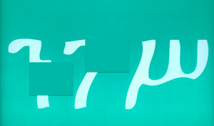 zzounn· edited
that was actually the plan, i only introduced the stripped PAL first to establish it as a precursor
the text-free PAL would function as a subdued backdrop on which artists could emblazon their respective virtual avatars onto. the PAL already commands redundant real estate on album artwork, so i envisioned that space becoming dual-purpose
something like this:

I mean your main reason for wanting to change it was that you couldn’t see the text when miniaturised.
I had to zoom in to make out what that actually was. So you’ve made something to solve a problem that no one thinks exists then you replace it by something that’s even harder to see?

Can you explain the rationale of that?

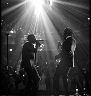 Aftermathbws_
I mean your main reason for wanting to change it was that you couldn’t see the text when miniaturised.
I had to zoom in to make out what that actually was. So you’ve made something to solve a problem that no one thinks exists then you replace it by something that’s even harder to see?

Can you explain the rationale of that?

my son i heard you the first time
actually the main reason was that the symbol has transcended the nascent stage that necessitates textual elaboration
the other point that you're referring to was secondary and isolated. i was just illustrating other contexts in which a minimalistic PAL would thrive in
also obviously im not proposing to tag a miniaturized PAL with an avatar
 zzounn
my son i heard you the first time
actually the main reason was that the symbol has transcended the nascent stage that necessitates textual elaboration
the other point that you're referring to was secondary and isolated. i was just illustrating other contexts in which a minimalistic PAL would thrive in
also obviously im not proposing to tag a miniaturized PAL with an avatar
Thanks for elaborating dad

So you’re plan with the avitar isn’t to use it at that size, but you just demonstrated it on that size? Unless you’re saying to use is as a background for an album cover for example with the avi on it at the full size which is even more ridiculous imo.
I get that the text isn’t needed because everyone knows what it is, but that’s true for a number of brands and they don’t feel the need to remove text.
The PA logo is iconic. There are even posters of just that logo. Why do we need to change it just because people know what it represents without reading. I find the whole thing a little perplexing
 Aftermathbws_
Thanks for elaborating dad

So you’re plan with the avitar isn’t to use it at that size, but you just demonstrated it on that size? Unless you’re saying to use is as a background for an album cover for example with the avi on it at the full size which is even more ridiculous imo.
I get that the text isn’t needed because everyone knows what it is, but that’s true for a number of brands and they don’t feel the need to remove text.
The PA logo is iconic. There are even posters of just that logo. Why do we need to change it just because people know what it represents without reading. I find the whole thing a little perplexing
how you my son but you never learn smh
its an unnecessary logo now anyway the only reason its used is for the aesthetic and the words are the whole point of that not the background design
na i like how the regular one looks more. even if you don’t read the text, the way the text looks with the image is ubiquitous
 zzounn· edited
that was actually the plan, i only introduced the stripped PAL first to establish it as a precursor
the text-free PAL would function as a subdued backdrop on which artists could emblazon their respective virtual avatars onto. the PAL already commands redundant real estate on album artwork, so i envisioned that space becoming dual-purpose
something like this:

oh hell f***ing no bruh

OP. Please don’t let the negative people in this thread get you down. I see exactly what you mean and I think it’s a dope idea. Lotta the s*** your saying is going over people heads. You should get into creative direction if you’re not already
 zzounn
how you my son but you never learn smh
I mean, from the overwhelming negative response maybe its you that needs to take note

 zzounn
thats the point tho lol
the logo has evolved past the stage of requiring a descriptor
its been universalized and thus the message has become implicit over time
No it hasn't... Maybe if your a music junkie with 0 kids.
No one is removing the literal words on a warning label for artistic merit. Don't be silly OP, this is stupid. Nobody wants a vague graphic design students minimalist logo to alert them that their kid is going to be listening to jerk off music.
If you speak English, you're aware of what this warning is trying to convey. Taking out the words and just going "Everyone knows what this means bro! It's minimalist" is the equivalent of removed temperature warnings on objects and just putting a hot or cold overlay on them. The only reason, people know what that label means is because it literally says "Parental Advisory Explicit Content". And unless the current population is immortal, we are never going to move onto a time where this label needs the literal words stripped off it.
