Personally, I dont like it. But I appreciate your artistic drive and willingness to share ideas

For years I've been saying we need to get rid of the atrocious parental advisory symbol so I respect you for doing this. This kind've reads too close to very popular Human Rights Campaign logo used today. But I like the train of thought you had!
Another talking point is the fact that digital cover do NOT need a pa sticker on them. It's listed as explicit in other ways, its totally unnecessary and should be culturally given up
I recommend you checking out Henry Dreyfuss's "Symbol Sourcebook". Its a catalog of universally known symbols across the globe. Theres a great foreword by Buckminster Fuller you can maybe find that talks about the importance of creating symbols that transcend language
If I find it I'll post it here

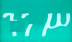 zzounn
This does nothing in terms of driving the point across. It looks like a flag when people have all attached themselves to the letters themselves. The letters became the symbols, not the shape. interesting take though
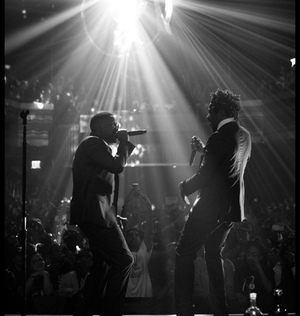 Aftermathbws_
Nah, that looks horrible
flying @ op doing all that and this being the first response
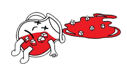
 zzounn
not really bc the main reason i made it tho was to serve as an unobtrusive backdrop on which to superimpose an artist’s virtual avatar onto
like an icon denoting ownership of the music
i think that's the future of packaging music
something like this:


I’m gonna need you to post as many of these as you have sir, empty the folder
 BLACK ☭May 31, 2020
 zzounn
not really bc the main reason i made it tho was to serve as an unobtrusive backdrop on which to superimpose an artist’s virtual avatar onto
like an icon denoting ownership of the music
i think that's the future of packaging music
something like this:


is cool if i ask what's your occupation? you've sparked my interest

sheesh at the first couple pages, homie just tryna share a concept lmao and actually put a lot of effort into it. i like the idea OP
I agree with everyone else tho I don't like the look of the actual symbol you created. In the side by sides I actually preferred the PA sticker but that's probably because that's what i'm conditioned to see. it looks more like a logo/imprint or something. i'd be interested to see how it looks with the original proportions.
 zzounn
thats the point, they intentionally are using outmoded graphics
its a sign of mid 2000s, PS2-era revivalism
They don't want to spend real money lmao
 aaaaaaaaa
you shouldn’t worry about things getting out of “fashion”, there’s a point in having different art movements goin on different times, it kinda reflects where society is at that given point
the whole minimalist movement is a big example, on how people are expressing themselves in a minimal fashion to counter the clutter mess that our lives in general have become
Everything cyclical obv. I’m saying this based off the tone of OP and the thread title. As a designer as well, I understand the desire to reduce things to the bare minimum, but the purpose of the parental advisory sticker is to tell you that it’s a parental advisor sticker for people who don’t know s*** about the music they’re buying.
Someone brought up a comparison to a stop sign, but I don’t think they’re the same. A stop sign exists as a giant red hexagon specifically because it’s easy to notice. The black and white stripes of the parental advisory sticker are incidental. zzounn
i’m proposing a simplified, textless Parental Advisory Logo:

the PAL has undergone a semiotic shift; it is ubiquitous while still so distinct that its unmistakable black-and-white rectangular bars alone communicate their inscribed warning
through repetition and hyper-visibility, this cautionary message has infused into the symbol itself, thus trivializing the need for any further clarification via text
just like how a plain red octagon has come to signify 'STOP', the PAL no longer requires an overt explanation to succeed as a functional warning label
in a globalized world, symbols have become the universal meta-language, and a label with text is nothing more than a vestige of a regionalized past


I understand what you are going for and the way you presented your idea is reasonable. I don’t like the execution but I feel like your proposition makes sense in the current climate of how we digest music.
On the other hand I do believe that the typography and the fonts used in the PA sticker play an equally significant role in its “aesthetic” (if that’s what you want to call it) and this doesn’t translate in the final PA sticker you are sharing with us.
Question is - do we really need the cover art to have the PA sticker all together? The streaming services are tagging the songs as explicit anyway, why does the cover art need it?
I think you touched on a much more interesting topic in this thread though, mentioning the digital avatars. I can see some artists slowly developing their own ‘digital’ icon.
Damn I need to replay Def Jam: Fight For New York.
 raichu
I understand what you are going for and the way you presented your idea is reasonable. I don’t like the execution but I feel like your proposition makes sense in the current climate of how we digest music.
On the other hand I do believe that the typography and the fonts used in the PA sticker play an equally significant role in its “aesthetic” (if that’s what you want to call it) and this doesn’t translate in the final PA sticker you are sharing with us.
Question is - do we really need the cover art to have the PA sticker all together? The streaming services are tagging the songs as explicit anyway, why does the cover art need it?
I think you touched on a much more interesting topic in this thread though, mentioning the digital avatars. I can see some artists slowly developing their own ‘digital’ icon.
Damn I need to replay Def Jam: Fight For New York.
that was actually the plan, i only introduced the stripped PAL first to establish it as a precursor
the text-free PAL would function as a subdued backdrop on which artists could emblazon their respective virtual avatars onto. the PAL already commands redundant real estate on album artwork, so i envisioned that space becoming dual-purpose
something like this:

Youre doing write-ups on this like you're fishing for a Pitchfork writer job
The white outline is distracting and unnecessary. The thirds proportions of it doesn't look good either. If anything, leave the sizing of the current one and just remove the text.
As you have it in these photos, the white outline makes it look like an element the artist chose to include themselves, and the proportions make it look like some kind of national flag or something for a protest movement

