 Dec 22, 2020·edited
 mothership
Hip hop fans generally have really bland taste and lack imagination, idk why. That uzi cover would’ve been great and the one we got was tacky as hell
it’s cause most of them are teenagers who don’t even have an identity or vision yet and latch onto hip hop for an image
if i gotta see another cover made using a magazine/insta photoshoot my eyes gonna roll into the back of my head
- Dec 22, 2020·edited
2nd cover in op looks like a my turn knockoff to me with carti on a cliff
and it’s using the same pose from @ meh
with empty space everywherecmon
that’d be acceptable for a high school project but expecting him to actually use it is laughable
 Dec 22, 2020·2 replies
 Smacked Voodoo
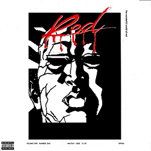
Like this would be fine. A call back to his SoundCloud days, which was the main inspiration for the album title. Cover is literally "a whole lotta red". It's minimalist. Let's the music speak for itself.

1. He’s used this before
2. Extremely on the nose and predictable
3. Covers should never be 1:1 literal representations of the titles of the albums they belong to, that’s lazy design
 Dec 22, 2020·5 replies
the cover wasnt terrible, but the lack of texture and the pic of carti they chose really made it look like a rushed 5 min Photoshop job.
I kept the soul of the design intact, just gave it a little more edge.

 Dec 22, 2020
 Litty
LittyThat’s why you gotta tell clients to pay upfront, or if not they can kick rocks
Too many scammers on the internet who just want free s*** and don’t value your time
yeah I realize that. I thought since he was a friend of a friend AND I was charging him the super cheap price there was no reason for him to not pay.
 Dec 22, 2020Smacked Voodoo
Like this would be fine. A call back to his SoundCloud days, which was the main inspiration for the album title. Cover is literally "a whole lotta red". It's minimalist. Let's the music speak for itself.
F*** nah lmfaoo
 Dec 22, 2020Smacked Voodoo
Like this would be fine. A call back to his SoundCloud days, which was the main inspiration for the album title. Cover is literally "a whole lotta red". It's minimalist. Let's the music speak for itself.
If it was a different red then I'd say yes, would be dope if it was like a crimson/bloodish red that looks like it's painted on canvas with texture n s***
- Dec 22, 2020GODFLOW
the cover wasnt terrible, but the lack of texture and the pic of carti they chose really made it look like a rushed 5 min Photoshop job.
I kept the soul of the design intact, just gave it a little more edge.
This is dope and I can understand where you’re coming from
I agree I do think it would have been a little better if the white was replaced with something with a little more texture but I still think it’s a good cover nonetheless
- Dec 22, 2020·1 replyshaleirose
1. He’s used this before
2. Extremely on the nose and predictable
3. Covers should never be 1:1 literal representations of the titles of the albums they belong to, that’s lazy design
Literally a vast majority of the fanmade covers are lazy as s*** so what is your point here?
- Dec 22, 2020·1 replyGODFLOW
the cover wasnt terrible, but the lack of texture and the pic of carti they chose really made it look like a rushed 5 min Photoshop job.
I kept the soul of the design intact, just gave it a little more edge.
Looks like a gay vampire here
- Dec 22, 2020Smacked Voodoo
Looks like a gay vampire here
THEY THOT I WAs GAY
 Dec 22, 2020
i think the problem is that fans are inherently reactionary and are drawn to pre-existing aesthetics when it comes to artists cos they have no other real reference point. whereas artists are likely to have moved on then and will be more likely to reflect that in the here and now
- Dec 22, 2020·1 replySmacked Voodoo
Literally a vast majority of the fanmade covers are lazy as s*** so what is your point here?
That’s exactly why I’m saying they’re garbage

- Dec 22, 2020
 doolcude
criticism of the savage mode ii cover art was completely lost on me. still can't believe people hate on Pen & Pixel covers to this day
i actually didnt like it at first cos it felt like random nostalgia bait but i like it a lot having actually listened to SM2 cos it actually interpolates a lot of that throwback sound into the music
- Dec 22, 2020·1 reply
forgot about when kids just take a photoshoot pic and put a parental advisory sticker on it

- Dec 22, 2020shaleirose
That’s exactly why I’m saying they’re garbage
I'd rather have something extremely simple and minimalistic than whatever it is they came up with here or whatever it is these fans are making. Don't even have to give the artwork much attention.
 Dec 22, 2020
Anyone who actually uses fan covers

 Dec 22, 2020·1 reply
what was the savage mode 2 cover? the one I see hard as f***.
 Dec 22, 2020Smacked Voodoo
Like this would be fine. A call back to his SoundCloud days, which was the main inspiration for the album title. Cover is literally "a whole lotta red". It's minimalist. Let's the music speak for itself.
this wouldve been corny at this point
- Dec 22, 2020
dudes on ktt were posting the red tile in the ‘red album covers’ thread 2 years ago.
its time to let the red tile go
 Dec 22, 2020
 interstellarflyin2
Those are pretty clean tho
comparing them to the old box logos, those are the worst
 Dec 22, 2020·1 replyclass wario
forgot about when kids just take a photoshoot pic and put a parental advisory sticker on it
Don't forget every amateur artist's favorite crutch

 Dec 22, 2020
 RoomOnFire
All red cover is cool

Minimalistic like his musicHis production is anything but minimalistic
 Dec 22, 2020Smacked Voodoo
Like this would be fine. A call back to his SoundCloud days, which was the main inspiration for the album title. Cover is literally "a whole lotta red". It's minimalist. Let's the music speak for itself.
That’s pre self titled era even lmao itd feel too outdated